Research Papers

Using Network Embedding to Obtain a Richer and More Stable Network Layout for a Large Scale Bibliometric Network

  • Ting Chen 1, 2, 3 ,
  • Guopeng Li 3 ,
  • Qiping Deng 4 ,
  • Xiaomei Wang , 3,
Expand
  • 1National Science Library, Chinese Academy of Sciences, Beijing 100190, China
  • 2Department of Library, Information and Archives Management, University of Chinese Academy of Sciences, Beijing 100049, China
  • 3Institutes of Science and Development, Chinese Academy of Sciences, Beijing 100190, China
  • 4Library, University of Electronic Science and Technology of China, Chengdu 611731, China
††: Xiaomei Wang (E-mail: ).

Received date: 2020-07-01

  Revised date: 2020-09-22

  Accepted date: 2020-10-20

  Online published: 2020-11-30

Copyright

Copyright reserved © 2020

Abstract

Purpose: The goal of this study is to explore whether deep learning based embedded models can provide a better visualization solution for large citation networks.
Design/methodology/approach: Our team compared the visualization approach borrowed from the deep learning community with the well-known bibliometric network visualization for large scale data. 47,294 highly cited papers were visualized by using three network embedding models plus the t-SNE dimensionality reduction technique. Besides, three base maps were created with the same dataset for evaluation purposes. All base maps used the classic OpenOrd method with different edge cutting strategies and parameters.
Findings: The network embedded maps with t-SNE preserve a very similar global structure to the full edges classic force-directed map, while the maps vary in local structure. Among them, the Node2Vec model has the best overall visualization performance, the local structure has been significantly improved and the maps’ layout has very high stability.
Research limitations: The computational and time costs of training are very high for network embedded models to obtain high dimensional latent vector. Only one dimensionality reduction technique was tested.
Practical implications: This paper demonstrates that the network embedding models are able to accurately reconstruct the large bibliometric network in the vector space. In the future, apart from network visualization, many classical vector-based machine learning algorithms can be applied to network representations for solving bibliometric analysis tasks.
Originality/value: This paper provides the first systematic comparison of classical science mapping visualization with network embedding based visualization on a large scale dataset. We showed deep learning based network embedding model with t-SNE can provide a richer, more stable science map. We also designed a practical evaluation method to investigate and compare maps.

Cite this article

Ting Chen , Guopeng Li , Qiping Deng , Xiaomei Wang . Using Network Embedding to Obtain a Richer and More Stable Network Layout for a Large Scale Bibliometric Network[J]. Journal of Data and Information Science, 2021 , 6(1) : 154 -177 . DOI: 10.2478/jdis-2021-0006

1 Introduction

In the field of bibliometrics and scientometrics, constructing and analyzing large-scale networks based on bibliographic data has become an urgent requirement for researchers. Science mapping is a data visualization tool that helps scientists compare their work and their field of research in relation to current research and development trends. Mapping the large-scale bibliographic networks has created significant opportunities for scholars, universities, and funding agencies to understand and explore the evolution of knowledge, dynamics of scientific disciplines, interdisciplinary, and structure of science. Visualization technique is a core tool that often used in science mapping. Many mapping studies have been done every year on analyzing various types of bibliometric networks based on citation, co-citation, or bibliographic coupling data or based on co-occurrences of keywords in documents. Most of the studies may focus on using existing mapping tools to display relations among specific datasets (Bartol et al., 2016; Li, Yang, & Wang et al., 2019), or they are improving the input relations for mapping algorithms (Katsurai & Ono, 2019). However, there are not many articles on how to improve the citation network visualization algorithm itself, and especially when there are a large number of nodes and relations in the network, only a few visualization solutions can be chosen for scholars.
In the past decade, the two most common approaches have been proposed for visualizing the map of science, the distance-based approach, and the graph-based approach (van Eck et al., 2010). Conceptually, both distance-based and graph-based approaches are very similar. The most significant difference between them is whether the distance between nodes indicates the similarity of nodes or not. For the distance-based approach, it is often used to depict topics and relationships of them within a scientific discipline (Boyack & Klavans, 2014; Boyack, Klavans, & Börner, 2005; Small & Griffith, 1974). For the graph-based approach, it is suitable for identifying landmark works and members of specialties to become familiar with a field (Chen, 1999; White, 2003). For large academic bibliometric networks, the most popular visualization approach is the distance-based dimensional reduction approach via Multidimensional Scaling (Kruskal, 1977; Liu, 1992) and force direct layout approach Vx-Ord/OpenOrd (Martin et al., 2011), which are used in two well-known visualization tools: VOS viewer (van Eck & Waltman, 2010) and Gephi (Bastian, Heymann, & Jacomy, 2009). These two mapping tools are used in most of the comprehensive bibliometric data analysis nowadays.
Distance-based dimensional reduction approach via Multidimensional Scaling and force direct layout approach VxOrd/OpenOrd, which are used in two well-known visualization tools: VOS viewer and Gephi. These two mapping tools are used in most of the comprehensive bibliometric data analysis nowadays. While these visualization methods and tools have many successful applications in the field of bibliometrics, but there are still some drawbacks to visualizing large networks. One of the drawbacks is the lack of stability. Stability is equally important as layout structure for science mapping but commonly neglected. For instance, the number of edges must be limited when we are visualizing a large network. Still, the network structure is susceptible to the number of edges, and different trimming strategies will have a massive impact on the final map. The mapping results of edge trimming and cutting are shown in Figure 1. Besides, the visualization methods themselves sometimes have strong randomness, and the visualization results are very different even we run the program with the same parameters. We demonstrate the randomness of OpenOrd with large network in Appendix Figure 7. Another drawback is the loss of local structural information. Local structure refers to the fine details and differences inside one research field or topic. A large-size science map sometimes contains multiple large clusters and plenty of outliers. It is, in some cases, difficult to visually distinguish the local structure, such as the base maps in this paper.
Figure 1. Three base maps created by OpenOrd with different cutting edges strategies and parameters. A is the map with 47,294 highly cited papers and all 3.6 million co-citation relationships, and OpenOrd cutting edge parameter is 0.8. B is the map with top 15 weighted relationships of each paper, and cutting edge parameter is 0.85. C is the map also with top 15 weighted relationships but cutting edge parameter is 0.9.
According to Helen’s survey research for graph layout techniques (Gibson, Faith, & Vickers, 2013), six aesthetic considerations are often used as criteria for a good mapping layout. They are: Minimize edge crossings; Symmetry; Uniform edge lengths; Uniform node distribution; Separate non-adjacent nodes; Node-edge overlap. In this context, aesthetics is associated with improving the readability of the map and making it more understandable to the user. The aesthetic criteria most commonly used in the force-directed graph layout explain why they are the most used techniques in network visualization. However, for science mapping, only consider the aesthetic criteria above are not enough. We wish to extend a scientist’s field of vision by providing a border landscape of science. The layout for a map of science must have a higher prerequisite for stability and accuracy. A good science map should combine aesthetic and information revealing considerations that allowed us quickly expose patterns, trends, and correlations that may otherwise go undetected. In this research, we add three information revealing considerations on a good science mapping layout:
$\bullet$ Stable global layout: An essential requirement for science mapping, a set of nodes (papers, authors, or keywords) from the same discipline or similar research topic should be in similar areas, and always be. In addition, the distribution of disciplines should also correspond to the similarity between disciplines; similar disciplines should be located more closely. For example, physics and space science studies are more similar, and engineering and materials science are more similar. A negative example is that space science is not adjacent to physics, but instead is close to medical research; such a distribution can be seen as an irrational global structure.
$\bullet$ Precise local structure: Minor communities should be grouped into sub-clusters rather than a few large clusters on the map. Small clusters should look like many dense clouds instead of a group of sparse points. Otherwise, it will not be able to present much useful information. In other words, the natural clusters in the map should represent small research topics rather than research disciplines. Existing large-scale network visualization techniques usually have a good effect on displaying the global structure, but not showing the local structure.
$\bullet$ Clear boundaries and gaps between research topics: There may be hundreds or thousands of clusters in a large network, which represent different research directions or topics. If there is no clear outline between clusters, it is impossible to distinguish clusters by color. The boundaries and gaps between small topics would improve the readability of the map and making it more understandable to the user.
It is important to mention that clear boundaries do not imply the physical boundaries between topics. On the contrary, today’s research topics may come from multiple fields, and such boundaries are becoming fuzzier over time. However, a good visualization algorithm requires to enhance the visual effect that allows our human eye to distinguish the research topics on the map clearly. We can’t distinguish more than twenty colors, so if the number of topics on map is more than one hundred, clear outlines are necessary. There is no contradiction between the clear boundaries between topics and the growth of the interdisciplinary since the paper in those topics can come from one discipline, also from many disciplines. The multidisciplinary within clusters enough to be used to reflect interdisciplinarity.
In this work, our team tries to compare the visualization approach from a deep learning community with the well-known OpenOrd method. It may be able to solve the lack of stability and loss of local structural issues. We proposed using three different networks embedding models to learn a low-dimensional latent representation of paper in citation networks, respectively, then utilizing the dimensionality reduction technique to project multi-dimensional representation of paper to a two-dimensional map. In the end, we visually and metrically compared network embedding maps with base maps.
This visualization technique method was chosen because of recent great prosperity in both feature extraction models and dimensionality reduction algorithms. Both the natural language embedding model and the network embedding model have made significant progress in recent years. The models learned the relationships between nodes, and models transform such relationships into low-dimensional vectoring data. Once embedding vectors were learned, the state of art visualization algorithm t-Distributed Stochastic Neighbor Embedding(t-SNE) become applicable, which is designed for vector data. See section 3 for more details on model selection and algorithms.
In recent years, scholars have investigated in using of network embedding and dimensionality reduction algorithms for the science mapping visualization (Shen et al., 2019), but how much it differs from the classic method and which model is more suitable is the main research of this paper. This article extends our work on a science mapping study based on ESI research fronts (Wang et al., 2017) and explicitly focuses on the visualization aspects. The main contributions are:
1. This paper clarifies the criteria for excellent visualization of the large scale science mapping beyond the aesthetic standards: Stable global layout, Precise local structure, and Clear boundaries and gaps between research topics.
2. This paper explored the feasibility of the new solution for visualizing the large cocitation network by combining bibliometric networks, network embedding models, and dimensionality reduction algorithm. Through comparative analysis, we found the most suitable network embedding model for the mission.
3. We showed the visualizations based on vector features from multiple embedded models. People can sense the changes and distributions of paper in the seven different maps and determine the merits of the visualizations easily.
4. In addition to visual contrast, we designed a practical validation method to investigate and compare maps generated by different models quantitatively.
The paper is structured as follows. Section 2 describes the test data and base maps used for this study. Section 3 describes the proposed visualization approach in detail and the validation method we planned to use in section 4. Section 4 presents and compares different embedding maps visually and metrically with the base maps. Section 5 discusses the observations discovered and future works.

2 Test dataset and base maps

47,294 highly cited papers in the Essential Science Indicators (ESI) were used to test the proposed visualization approach. The data were collected in March 2018. Two main reasons we use the ESI highly cited paper: (1) highly cited paper is often used to build up various maps of science (Bornmann et al., 2011; Small, 1999; Zhai & Di, 2019). (2) the ESI database also includes research fronts information regarding each research paper so that we can utilize the research fronts as a possible class label for evaluation.
In contrast, we mapped the test data set on two-dimensional space by using four different visualization methods, including a co-citation network plus OpenOrd and three network embedding models with t-SNE algorithm. Among them, co-citation networks plus OpenOrd were used as the base maps. They were used to visually and metrically compare with the network embedding maps created in next section.
Figure 1 represents base maps created by OpenOrd with different cutting edges strategies and parameters. The OpenOrd algorithm is the classic way of creating a large-scale science map in bibliometrics. Figure 1A is the base map created by OpenOrd in Gephi with 47,294 highly cited papers and all 3.6 million co-citation relationships, the edge cut parameter for OpenOrd is default 0.8. Figures 1B and 1C are the maps both created with only top 15 weighted relationships of each paper (454,879 edges). The edge cut value of B is 0.85 and the edge cut value of C is 0.9. When there is a large amount of nodes, it is common practice to keep the top 15 highest weight edges per node in order to reduce the computational cost while maintaining as much structure as possible (Boyack & Klavans, 2014; Boyack, Small, & Klavans, 2013; Boyack et al., 2011). The Ochiai coefficient (Zhou & Leydesdorff, 2016) was used for the normalization of co-citation relatedness. The test dataset, including articles’ UT, Field, Publish Year, Cites, all normalized relationships and the top 15 highest weight relationships are stored in the Science Data Bank (Chen, 2020).
As can be seen from the Figure 1, map A which contains full co-citation links is good at retaining the global structure. Most disciplines present its own distinct area on the map. The physics (dark purple), chemistry (light purple), materials (gray), engineering (yellow), and space science (deep red)’ paper are placed on left side of the map. Biology (orange) and medicine (blue) are on the right side of the map. Paper from these two disciplines intertwined which makes perfect sense because they have the largest number of paper and very high similarity between them. However, the local structure of map A is not very perfect. There are no clear boundaries between disciplines, no distinction between sub-disciplines (topics) in any of the disciplines. Besides, there are many outliers distributed on the map. This phenomenon refers to the poor cohesion of the map. To generate a more meaningful visualization layout of the science map, we are looking for an approach that preserves more local structures within topics and, at the same time, preserving the global structure as much as possible.
Both map B and C only used only 13% of the highest weighted edges (top 15 edges of each node), and to further enhance the diversity and reliability of the base maps, we have increased the OpenOrd’s edge cutting parameter from 0.8 to 0.85 and 0.9. The edge cutting in OpenOrd allows users to control the white space between node clusters. A higher edge cutting value corresponds to an aggressive cutting strategy and allows more clusters to appear. We wish to improve the local structure of map B and C by adjusting the parameters.
After observing map B and C, we conclude that the global structure of map B and C is not as good as map A. Papers from different disciplines are mixed all over the map. For instance, chemistry (light purple) is completely mixed with biology (orange) and medical (blue) papers. From a visualization point of view, there is also no significant improvement in the local structure. We will further evaluate the local structure of different maps in section 4.2 by applying a metric indicator.
As mentioned earlier section, we also found that the global structure of the OpenOrd varies, and different edge-cutting strategies can have a significant impact on the global structure, see Figure 1. In addition, this study also plotted nine maps with the same parameters as base map C (Appendix Figure 7). It can be seen that the global structure of each plot varies considerably.

3 Proposed visualization approach

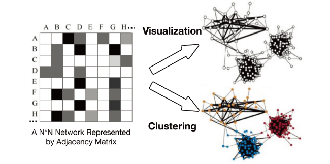
Networks analysis is commonly used in real-world applications like analysis based on social networks, protein interactions, or citation networks. Science mapping is one of the network analysis, where the two most common analytical perspectives are network clustering and visualization (Figure 2). Classic network representation uses a two-dimensional adjacency matrix to represent a graph G = (V, E). Graph G is a collection of nodes or vertices (V) and edges (E) between them. The elements of the matrix indicate whether pairs (E) of vertices (V) are adjacent or not in the graph. These edges might be weighted or non-weighted. The citation network is one of the classic networks which describes the inter-citations between the papers, authors, or organizations. Take citation network of paper as an example: The network regards papers as nodes and contains a link from paper i to paper j, if i cites j. The idea of a research paper, more or less inspired by its references. Therefore, the link in the citation network is one of the causal relationships between the research paper. Since the research citation links are responsible for academic acts by scientists, we consider the citation network to be the highest quality and most trusted types of networks. Due to the high quality of the citation network, we are encouraged to try novel algorithms and models to mine it for more value.
Figure 2. The classical process of network clustering and visualization.
Indeed, the nodes and edges 2-dimensional matrix representation cannot embody more complex, higher-order structure relationships and multiple levels of structures in a real-world information network. There are limited mathematical or statistical methods that can be applied to the networks. As a result, such a simple representation makes large-scale networks analysis and visualization very difficult. Recently, the enormous increase in computing power combined with advances in deep learning models make it possible to discover the structure of science on a large scale. To tackle the challenge above, we try to use the embedding techniques from the deep learning (representation learning) community, adopting the neural network to learn the latent, low-dimensional representation of nodes in the bibliometrics co-citation network while preserving network topology structure of origin network. After new vertex representations are learned, network analytic tasks can be easily and efficiently accomplished by applying conventional vector-based machine learning algorithms to the new representation space, etc., clustering, classification, or visualization. Figure 3 is the flowchart of the visualization approach we proposed. It comprises two main steps. Firstly, we extract the low-dimensional representations of nodes in the network by applying network embedding models. Once the new representations are obtained in the vector space, the second step is using the t-distributed stochastic neighbor embedding (t-SNE) algorithm (Maaten & Hinton, 2008), as dimensionality reduction technique to project nodes from low-dimensional space into a two-dimensions map. The distance between the coordinates of points in two-dimensional space represents their relationship in higher-dimensional space.
Figure 3. The flowchart of the proposed visualization approach.

3.1 Network embedding

Network embedding is the transformation of property graphs to a vector. Embedding should capture the graph topology, node-to-node relationship, and other relevant information about graphs, subgraphs, and nodes. Network embedding is based on the idea of the word embedding (Le & Mikolov, 2014) that uses the skip-gram neural network. It normally consists of two steps, firstly model will be sampling and relabeling all nodes by treating nodes as words and generating short random walks as sentences. Then, neural language models such as the Skip-gram model can be applied to random walks to obtain network embedding. The network embedding model embeds the network into a new latent space of low dimensionality, i.e. each node now can be represented by a 100-dimensional vector. In this study, three popular network embedding models were used: Node2Vec (Grover & Leskovec, 2016), DeepWalk (Perozzi, Al-Rfou, & Skiena, 2014), and Line (Tang et al., 2015). Table 1 showed three models in two categories: building the context of nodes and learning method.
Table 1 Models (used in this paper) categorized by building and learning method.
Model Building context of nodes Learning method
DeepWalk Truncated Random Walks Skip-gram & Hierarchical Softmax
Line 1-hop and 2-hop Neighbors Skip-gram & Negative Sampling
Node2Vec Biased Truncated Random Walks Skip-gram & Negative Sampling
The DeepWalk model is the first proposed network embedding model. It introduced a two-phase method for learning node feature vector. The first step of DeepWalk is to identify the context nodes for each node. By generating random walks process in a network (which are similar to sentences in language model), the context nodes of a node can be defined as the set of nodes within a window size in each random walk sequence. Once the context nodes have been determined, the second step is the same as that of the original Skip-gram model: learn embedding, which maximizes the likelihood of predicting context nodes. DeepWalk uses the same optimization goal and optimization method as Skip-gram.
Most network embedding models have followed a two-phase framework proposed in Deep-Walk with variations. Line adopts a breadth-first search strategy for generating context nodes: only nodes that are at most two hops away from a given node are considered as its neighboring nodes. Besides, it uses negative sampling to optimize the Skip-gram model, in contrast to the hierarchical softmax used in DeepWalk. Node2Vec is an extension of Deep-Walk, which introduces a biased random walking procedure to identify the context of the node.

3.2 t-SNE for dimensionality reduction

Once we can reconstruct the citation network into a low-dimensional vector space, all the machine learning and deep learning algorithms become applicable, including the state of art visualization algorithm t-Distributed Stochastic Neighbor Embedding (t-SNE). t-SNE is a nonlinear dimensionality reduction technique that aims to reproduce in a low-dimensional space the local and global neighborhood similarities observed on any high-dimensional vector space. It is particularly well suited for the visualization of high-dimensional datasets.
Conceptually, the t-SNE algorithm can be described as follows. The t-SNE models the probability distribution of neighbors around each point. The term neighbors refer to the set of points that are closest to each point. It starts by calculating the probability of similarity of points in high-dimensional space and calculating the probability of similarity of points in the corresponding low-dimensional space. The similarity of points is calculated as the conditional probability under a Gaussian distribution.
The algorithm then tries to minimize the difference between these conditional probabilities (or similarities) in higher-dimensional and lower-dimensional space for a perfect representation of data points in lower-dimensional space. To measure the minimization of the sum of difference of conditional probability t-SNE minimizes the sum of Kullback-Leibler divergence (Kullback & Leibler, 1951) of overall data points using a gradient descent method. Ideally, close neighbours remain close and distant points remain distant. The t-SNE algorithm is rarely applied to science mapping data, even though it is commonly used in other fields, such as biological information, news text data, etc. (Chen, Wang, & Wang, 2020; Li et al., 2017; Liu et al., 2018; Pezzotti et al., 2017).

4 Visualization results

The following visualization results are executed on a machine with 128GB memory, 32 cores CPU at 2.13GHz. Only one CPU core ever used in all the experiments. The running time of three embedding models are very different. For the Line model, the running time is 182 minutes. The DeepWalk model takes 144 minutes. The Node2Vec model is a little bit faster than Line and DeepWalk. It takes 93 minutes to obtain network vectors. The process of visualization in t-SNE is also very time-consuming, especially on large-scale data sets. t-SNE model takes 46 minutes to create a two-dimension map with 47,294 nodes from 100-dimension network embedded space. All four embedding models were tested with parameters as follows: For Node2Vec and DeepWalk models, the number of walks is 10, walk length is 80, q and p are 1. For Line model, the negative ratio is 5, the order is 3.
For the t-SNE dimensionality reduction algorithm, the perplexity is the most important parameter. It controls the width of the Gaussian kernel used to compute similarities between points and how many of its nearest neighbors each point is attracted. Larger perplexity provides stronger attractive forces during t-SNE optimization, the map will pull larger structures together but lose some fine detail. From past experience of using this algorithm, if dataset’s size is around 50 thousand, perplexity should be set to 50 more or less. In this study, we choose perplexity 25, which is slightly less than the default value in most t-SNE implementations. The reason is that missing local detail is one of the drawbacks of existing large-scale science map, so a smaller perplexity can reveal better local structure and smaller cluster can be shown on the map. Except for perplexity, other parameters such as early exaggeration or learning rate have little influence on the final visualization. Final parameter setting for t-SNE is perplexity 25, early exaggeration 50 and learning rate 120.

4.1 Visually comparison

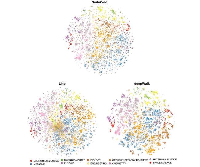
The quality of network visualization by different embedding algorithms was evaluated visually in Figure 4. Each ESI highly cited paper was mapped into a two-dimensional space as a small point on the map. Distinct color on the point represent the scientific discipline. As can be seen, all three embedding models exhibit a very similar global structure with OpenOrd base map A (Figure 1). Papers belong to Medicine and Biology are placed at the right bottom part of the map. Papers belong to Space science, Physics, Chemistry, and Material are placed on the left side. Papers belong to Math, Computer, and Engineering are placed on the top of the map. Papers belong to Social and Business are placed on the right side beside. Papers belong to Geoscience and Environment are placed at the center of the map.
Figure 4. Illustrations of visualization of highly cited paper co-citation network by different embedding models with t-SNE.
However, if we focus on the local details, the embedding visualization maps are very different from the co-citation base map. In the base map, the points are relatively evenly distributed, and there are no apparent boundaries and contours between any sub-topics. Visually, it is challenging to distinguish sub-topics on the base map. Compared to the cocitation base map, three visualization maps seem to have some improvement in the local structure, but some maps are better than others. The map of Line is not entirely satisfied as others because the points at the center part of the map belonging to different disciplines are mixed. For the DeepWalk map, the sub-topics are formed clearly. However, the size of the sub-topics looks bigger than either Line or Node2Vec maps. More importantly, the papers from Biology, Medicine, and Geo science are still mixed a little bit in the center part of the map. The global structures of Node2Vec and base map A are most similar, but the visualization of Node2Vec performed much better in both sub-topic separation and boundary aspects. The small sub-topics are formed in each major discipline. The clear silhouettes appeared between sub-topics. For instance, on Node2Vec map, the red nodes at the top left are space science paper. They were divided into 8 smaller clusters. But space science paper on OpenOrd and DeepWalk maps looks like a whole piece or two pieces chunks. The Line map has a similar local structure with Node2Vec map on the outer side of the map, including space science area. Unfortunately, biology and medicine papers are mixed in the center.
Through our visual observations, the Node2Vec map is the best among several maps, it looks like uncovered hidden local structures in the data and exposes the sub-topics in each discipline. Moreover, outliers in the OpenOrd map do not appear to be outliers in the Node2Vec map, most of these original outliers moved into the sub-topics or formed as new sub-topics.

4.2 Metrically comparison

Visually, the Node2Vec map looks “nicer” (our opinion and that of all colleagues). However, quantitative analysis is still necessary for verifying visualization maps, even if this is a difficult job. As a general measure of the structuredness of the bibliometrics network, we formulate it as an unsupervised clustering problem. We borrowed the internal clustering evaluation methods adopted by machine learning to evaluate the visualization quantitatively.
Internal cluster validation uses the internal information of the clustering process to evaluate the goodness of a clustering structure without reference to external data. The measure of validation reflects the cluster cohesion and the separation of the cluster partitions. Cluster cohesion measures how close the objects are within the same cluster. Separation measures how well-separated a cluster is from other clusters. A good clustering result requires stronger cohesion in each cluster and broader separation between clusters. As mentioned in the previous section, the co-citation network of ESI highly cited papers was used as our test data set. Ideally, the paper in the same research front should have stayed closer than paper from other research fronts on the map. And more ideally, there should be a boundary between different large research fronts. These visualization requirements are very similar to the requirements of excellent clustering results. So, if two maps contained similar global structure, internal cluster validation can be used for measuring the local structure of maps. As mentioned in the previous section, to create a map with a better local structure is one of the important goals of this study.
In this paper we choose Silhouette Coefficient (SC) method to evaluate our visualization results, The SC is defined for each sample and is composed of two scores: (1): The mean distance between a sample and all other points in the same class. (2): The mean distance between a sample and all other points in the next nearest cluster. The SC for a single sample is then given as: s = (b-a)/max(a, b), the SC for a set of samples is given as the mean of the SC for each sample. A larger average silhouette refers to better consistency within clusters and the clusters are “separated” better from its other clusters.
In this study, the x / y coordinates of each paper on the map can be regarded as two features of the paper, and the ESI research front of each paper can be regarded as a class label. Because the coordinates and label information of each article are known, we can use the SC to measure the distances of the paper within a research front in comparison with distances within different research fronts. Higher SC score relates to an approach with better-defined topics on the map.
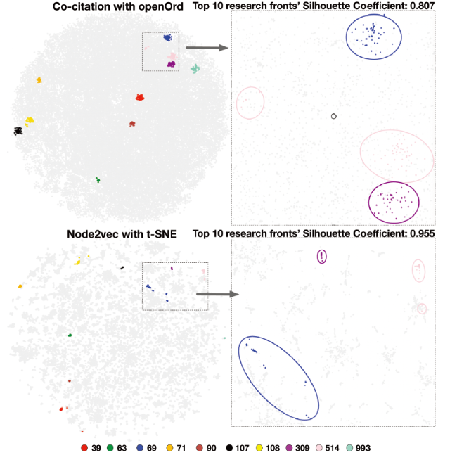
We first collected paper from the 10 largest research fronts of each discipline (Table 2) to calculate the SC and overlay them on both classic co-citation maps and the Node2Vec map. The SC results of the 10 largest research fronts can be seen in Table 3. The SC of Node2Vec plus t-SNE map is 0.955. It is much higher than SC of co-citation plus OpenOrd base map A. The latter’s SC is only 0.807. SC of base maps B and C are much lower than base map A. It can also be seen from Figure 5 that the dissimilar between the two maps is easy to observe. Although the 10 research fronts in both maps are clustered together, the area occupied by 10 research fonts in the classic map is much bigger than the Node2Vec map. From the zoom-in map, the paper of three fronts are sparsely distributed in classic maps. The aggregation effect is not very strong, and there is no obvious outline with the surrounding paper. If the color of the paper on classic map is removed, it is difficult for our human eyes to tell whether those points belong to any research fronts. On the Node2Vec map, the paper is very closely distributed, and the map has apparent boundaries between those fronts.
Table 2 Detail of top 10 ESI fronts of each discipline overlaid in Figure 5.
ID&Field Research front keywords #paper
993, Social sciences, general Police agency directed randomized field trial; police legitimacy invariant; police legitimacy; police officer body-worn cameras (bwcs) 30
39, Clinical medicine Triple-negative essential thrombocythemia patients; myeloproliferative neoplasm-associated myelofibrosis;primary myelofibrosis 50
514, Computer science Multigranulation fuzzy decision-theoretic rough set; triangular fuzzy decision-theoretic rough sets; intuitionistic fuzzy decision-theoretic rough sets; multigranulation decision-theoretic rough sets; 47
108, Physics Frozen quantum coherence;measuring quantum coherence; genuine quantum coherence; quantum coherence; quantum thermodynamics 49
90, Biology & biochemistry Reversible m(6)a rna methylation; rna m(6)a methylation; m(6)a rna methylation; m(6)a rna modification controls cell fate transition; viral m(6)a rna methylomes 42
309, Engineering Particle swarm optimization-based maximum power point tracking algorithm; maximum power point tracking control techniques;maximum power point tracking (mppt) techniques;observe (p&o) maximum power point tracking (mppt) algorithm;maximum power point tracking techniques 36
69, Geosciences Greenland ice sheet surface mass balance contribution; 1900-2015 greenland ice sheet surface mass balance; potential antarctic ice sheet retreat driven;northeast greenland ice sheet triggered;simple antarctic ice sheet model 43
63, Chemistry 3d porous crystalline polyimide covalent organic frameworks;crystalline 2d covalent organic frameworks; homochiral 2d porous covalent organic frameworks; large-pore crystalline polyimide covalent organic frameworks;highly crystalline covalent organic frameworks 45
107, Materials science Equiatomic high-entropy alloy crmnfeconi; equiatomic high-entropy alloys; single-phase high-entropy alloy crmnfeconi; nanocrystalline cocrfemnni high-entropy alloy; single-phase high-entropy alloys 37
71, Space science Small kepler planets; kepler transit candidates xvii; potentially habitable planets orbiting m dwarfs estimated; earth-size planets orbiting sun-like stars 31
Table 3 Silhouette Coefficient of research fronts on five maps.
Number
of RF
Co-citation
map
A
Co-citation
map
B
Co-citation
map
C
N2V &
tSNE
DW &
tSNE
Line &
tSNE
10 0.807 0.71 0.73 0.955 0.839 0.637
50 0.633 0.58 0.6 0.721 0.543 0.438
100 0.589 0.52 0.56 0.656 0.437 0.370
200 0.529 0.43 0.42 0.570 0.353 0.306
500 0.407 0.29 0.29 0.438 0.193 0.190
1,000 0.302 0.18 0.27 0.313 0.047 0.054
10,096 -0.227 -0.26 -0.26 -0.279 -0.469 -0.455

Note: Base map1 is Co-citation map with full edges, cutting edge=0.8; Base map2: Co-citation map with 15 top edges, cutting edge=0.85; Base map3: Co-citation map with 15 top edges,cutting edge=0.9.

Figure 5. Research fronts overlapped on the classic co-citation map A and Node2Vec map with a zoom-in view.
In Figure 5, the visual judgment and the SC result are consistent, and this shows that the calculation of the SC by using the research front’s labels and their positions can well reflect the local structure of the map. Moreover, it can be observed that there are very few outliers in the map of the Node2Vec model. Most of the sparse points in classic map are placed beside the mainstream cluster so that if necessary, the remaining outliers can be easily found by the algorithm automatically, and this is also a small advantage for the Node2Vec map. If we only consider these 10 research fronts, the visualization results of Node2Vec are undoubtedly better.
The SCs of six maps are presented in Table 3. It quantitatively demonstrated the superiority of the Node2Vec model in visualizing the highly cited paper’s co-citation relationships. No matter 10 or 1000 research fronts were selected, the SC score of Node2Vec plus t-SNE map is always the highest. Beyond our expectations, the classic co-citation map with all 3.6 million edges (co-citation map A) performs very well from the perspective of internal validation, and the SC score is higher than t-SNE with several other embedding models and higher than maps that reduce the number of edges (co-citation maps B and C). Our speculation for this phenomenon is that because the science fronts are originally clustered by measuring the distance in similarity matrices, the classic visualization algorithm also calculates the distance between paper to map the relationship. The clustering algorithm and the visualization algorithm have certain unity in theory, and full links also helped map maintained better overall structure. So the classic visualization algorithm may perform better when calculating the SC by using the research fronts labels.
If we include all research fronts into the evaluation, and the Node2Vec map is -0.279, the SC of the classic network map is -0.227, which is lower than the classic network map. When SC is negative, it is indicating that there is no silhouette between classes, even clusters are intertwined. The negative SC result may be due to the fact there are so many research fronts and 50% of the research fronts contain less than 10 papers. We guess the ESI research fronts may split some perfect clusters into multiple small clusters. The number of ESI clusters are over 10,000 and majority part of them are small or ultra-small clusters may lead SC to not work in this case. Therefore, although the SC values based on 10,096 classes are listed in Table 3, they are for reference only.

4.3 Stability of the Node2Vec maps

In our team’s past science mapping experience, there has always been a problem where the structure of the mapping varies each time, which made it difficult for us to choose a map for using in analysis report. This structure shifting problem has rarely been mentioned in past research. We ran OpenOrd nine times with top 15 edges of each node and parameter edge cutting is 0.9. Figure 7 in Appendix shows the global structure of each plot varies considerably.
We used the space science (red) and medicine papers (blue) as anchor points, and rotated the nine graphs at the same angle. It can be clearly observed that the distribution of space science papers varies significantly in the figure, sometimes at the top, sometimes in the middle, sometimes in one area, and sometimes scattered into several small areas. Such changes are similar in medicine (blue), chemistry (light purple), engineering (yellow), etc.
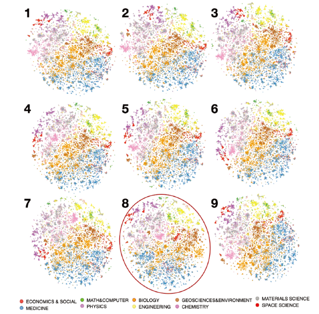
Improving the consistency of scientific mapping is an essential purpose of the visualization algorithm. In this section, we further test the stability of the visualization algorithm proposed in this paper. Figure 6 demonstrates the stability of the Node2Vec maps. We executed t-SNE nine extra times with the same parameters to test the stability of the proposed approach. We wish to compare the nine maps with the Node2Vec map in Figure 4, which seems to be the best results among all models. The nine maps can be seen in the figure below. We can observe that only map 8 is different from the Figure 4 Node2Vec map. The rest of the maps have almost the same global and local structure.
Figure 6. Layouts of nine Node2Vec maps with the same parameters.
Although we highlighted map 8, the global structure of map 8 is still acceptable. The position of the paper in some disciplines has changed a little bit. For instance, Chemistry (pink) paper located in the middle of the map instead of the right edge, also the Economics & social science (red) paper shifted from the right edge to the center. Medicine (blue) and Biology (orange) switched sides. In most of the maps, Biology paper located in the center and Medicine paper located below them. Map 7 is slightly different from other maps. Only the Chemistry paper has moved from the edge to the middle, everywhere else is very similar to others. The rest of seven maps plus the Node2Vec map in Figure 4 are very similar in both global and local structures, and they seem to have just changed their angles. Of course, if we look closely, there are slight differences in fine details between maps. For instance, in all maps, the Space science paper is on the left of the Physics paper, but in map 3 the positions of the two disciplines were switched to each other. Overall, map created by Node2Vec plus t-SNE has very strong consistency and stability, especially in comparison to Figure 7.

5 Conclusion and future works

The t-SNE is a state-of-the-art algorithm for dimensionality reduction. It is widely used for mapping high-dimensional data in two-dimensional space. It was difficult to introduce it into the research of science mapping before because of a lack of high dimensional representation for bibliometrics networks. After the rapid development of deep learning techniques, it has become possible to apply the t-SNE to large citation networks by embedding the networks into a virtual vector space.
In this study, the main research focus is on exploration of embedded models. We explored the applicability of network embedding models and the t-SNE algorithm for visualizing the ESI paper co-citation network. We have compared network embedding maps with base maps and made these observations: (1) t-SNE plus network embedding models are able to separate papers from different scientific disciplines. Three network embedding models preserve a very similar global structure with classic OpenOrd algorithm with full links map. (2) Visualization of using Node2Vec model performed the best in both sub-topic separation and boundary aspects. It exposed the sub-topics in each discipline, and preserved much better local structure than others. Maps created by other two models do not perform better than OpenOrd. (3) Unlike OpenOrd, t-SNE plus Node2Vec in this dataset are more robust with respect to the presence of outliers. (4) Map created by Node2Vec plus t-SNE has very strong consistency and stability. (5) Using the t-SNE algorithm to visualize a network with almost 50,000 nodes and 3.5 million links is a very slow process and requires expensive computing resources. The total execution time is 1.5 hours. (6) While the network embedding and t-SNE algorithms present a clearer separation of sub-topics, but the reduced intuitive readability caused by the nodes overlapping cannot be ignored.
Through visual observation and calculation of the silhouette coefficient, we believe that the Node2Vec plus t-SNE map has dramatically improved the display of local features, giving the map richer details. The proposed mapping approach could be a new visualization solution for science mapping. As this study is only at the exploration stage and one kind of data has been tested, we need to test further the effectiveness of network embedding for different kinds of bibliometric research perspectives, as well as to improve the execution time. We will further test other dimensionality reduction algorithms such as UMAP algorithms with more real world scientometrics applications, rather than limited to t-SNE or highly cited papers only. In addition to its application in visualization methods, network embedding can also be applied in more bibliometric research directions. Once new node representations are learned via network embedding models, a lot of classic vector-based machine learning algorithms can be used to solve important analytic tasks, such as classification, link prediction, clustering, and novelty detection, etc.

Acknowledgments

This work is funded by the strategic research project of the Development Planning Bureau of the Chinese Academy of Sciences under Grant No.GHJ-ZLZX-2019-42, and the Youth Fund Project of Institutes of Science and Development, Chinese Academy of Sciences under Grant name “Research on Key Methods in Comparison of Scientific Funding Layout.”

Author contributions

Chen Ting (chenting@casisd.cn): Conceptualization (Equal), Investigation (Lead), Methodology (Lead), Software (Lead), Visualization (Lead), Writing-original draft (Lead), Writing-review & editing (Lead); Guopeng Li (liguopeng@casisd.cn): Data curation (Lead), Formal analysis (Equal), Resources (Equal), Writing-review & editing (Equal); Qipeng Deng (dengqp@uestc.edu.cn): Data curation (Equal), Investigation (Equal), Resources (Equal), Software (Equal); Xiaomei Wang (wangxm@casisd.cn): Conceptualization (Lead), Project administration (Lead), Supervision (Lead), Writing-review & editing (Equal).

Appendix

Figure 7. Nine OpenOrd maps with top 15 edges of each nodes and cutting edge parameter = 0.9.
[1]
Bartol, T., Budimir, G., Juznic, P., & Stopar, K. (2016). Mapping and classification of agriculture in Web of Science: Other subject categories and research fields may benefit. Scientometrics, 109(2), 979-996.

[2]
Bastian, M., Heymann, S., & Jacomy, M. (2009). Gephi: An open source software for exploring and manipulating networks. Third international AAAI conference on weblogs and social media.

[3]
Bornmann, L., Leydesdorff, L., Walch-Solimena, C., & Ettl, C. (2011). Mapping excellence in the geography of science: An approach based on Scopus data. Journal of Informetrics, 5(4), 537-546.

DOI

[4]
Boyack, K.W., & Klavans, R. (2014). Creation of a highly detailed, dynamic, global model and map of science. Journal of the Association for Information Science and Technology, 65(4), 670-685. doi: 10.1002/asi.22990, URL https://dx.doi.org/10.1002/asi.22990

DOI

[5]
Boyack, K.W., Klavans, R., & Börner, K. (2005). Mapping the backbone of science. Scientometrics, 64(3), 351-374.

DOI

[6]
Boyack, K.W., Newman, D., Duhon, R.J., Klavans, R., Patek, M., Biberstine, J.R., Schijvenaars, B., Skupin, A., Ma, N., & Börner, K. (2011). Clustering More than Two Million Biomedical Publications: Comparing the Accuracies of Nine Text-Based Similarity Approaches. PLoS ONE, 6(3), e18029-e18029. doi: 10.1371/journal.pone.0018029

PMID

[7]
Boyack, K.W., Small, H., & Klavans, R. (2013). Improving the accuracy of co-citation clustering using full text. Journal of the American Society for Information Science and Technology, 64(9), 1759-1767. doi: 10.1002/asi.22896

DOI

[8]
Chen, C.M. (1999). Visualising semantic spaces and author co-citation networks in digital libraries. Information Processing & Management, 35(3), 401-420.

DOI

[9]
Chen, T. (2020). Essential Science Indicators highly cited paper co-citation relationships 2018.3. V1. DOI http://www.dx.doi.org/10.11922/sciencedb.00256, http://www.dx.doi.org/10.11922/sciencedb.00256, URL http://www.dx.doi.org/10.11922/sciencedb.00256

[10]
Chen, T., Wang, H., & Wang, X. (2020). Detecting Funding Topics Evolutions with Visualization(in Chinese). Data Analysis and Knowledge Discovery, 4(2/3).

[11]
van Eck, N.J., & Waltman,, L. (2010). Software survey: VOSviewer, a computer program for bibliometric mapping. Scientometrics, 84(2), 523-538.

DOI PMID

[12]
van Eck, N.J., Waltman, L., Noyons, E.C.M., & Buter, R.K. (2010). Automatic term identification for bibliometric mapping. Scientometrics, 82(3), 581-596.

DOI PMID

[13]
Gibson, H., Faith, J., & Vickers, P. (2013). A survey of two-dimensional graph layout techniques for information visualisation. Information Visualization, 12(3-4), 324-357.

[14]
Gibson, A., & Leskovec,, J. (2016). Node2Vec: Scalable feature learning for networks. In Proceedings of the 22nd ACM SIGKDD international conference on Knowledge discovery and data mining, ACM, pp 855-864.

[15]
Katsurai, M., Ono, S. (2019). TrendNets: Mapping emerging research trends from dynamic co-word networks via sparse representation. Scientometrics, 121(3), 1583-1598.

[16]
Kruskal, J.B. (1977). Multidimensional scaling and other methods for discovery structure. In: Enslein, K., Ralston, A., & Wilf, H. (eds) Statistical methods for digital computers, Wiley.

[17]
Kullback, S., & Leibler, R.A. (1951). On Information and Sufficiency. The Annals of Mathematical Statistics, 22(1), 79-86. doi: 10.1214/aoms/1177729694

[18]
Le, Q., & Mikolov, T. (2014). Distributed representations of sentences and documents. In Proceedings of the 31st International Conference on Machine Learning, pp 1188-1196.

[19]
Li, P., Yang, G.L., & Wang, C.Q. (2019). Visual topical analysis of library and information science. Scientometrics, 121, 1753-1791.

[20]
Li, W.T., Cerise, J.E., Yang, Y.N., & Han, H. (2017). Application of t-SNE to human genetic data. Journal of Bioinformatics and Computational Biology, 15(4), 1750017-1750017.

PMID

[21]
Liu, S., Bremer, P.T., Thiagarajan, J.J., Srikumar, V., Wang, B., Livnat, Y., & Pascucci, V. (2018). Visual Exploration of Semantic Relationships in Neural Word Embeddings. IEEE Transactions on Visualization and Computer Graphics, 24(1), 553-562.

DOI PMID

[22]
Liu, Z. (1992). Visualizing the intellectual structure in urban studies: A journal co-citation analysis. Scientometrics, 62(3), 385-402.

[23]
Maaten, L.V.D., & Hinton, G. (2008). Visualizing data using t-SNE. Journal of Machine Learning Research, 9, 2579-2605.

[24]
Martin, S., Brown, W.M., Klavans, R., & Boyack, K.W. (2011). OpenOrd: An open-source toolbox for large graph layout. International Society for Optics and Photonics, 7868, 786806-786806.

[25]
Perozzi, B., Al-Rfou, R., & Skiena, S. (2014). Deepwalk: Online learning of social representations. In: Proceedings of the 20th ACM SIGKDD international conference on Knowledge discovery and data mining, ACM, pp 701-710.

[26]
Pezzotti, N., Lelieveldt, B.P.F., van der Maaten, L., Hollt, T., Eisemann, E., & Vilanova, A. (2017). Approximated and User Steerable tSNE for Progressive Visual Analytics. IEEE Transactions on Visualization and Computer Graphics, 23(7), 1739-1752.

DOI PMID

[27]
Shen, Z.S., Chen, F.Y., Yang, L.Y., & Wu, J.S. (2019). Node2vec representation for clustering journals and as a possible measure of diversity. Journal of Data and Information Science, 4(2), 79-92.

[28]
Small, H. (1999). Visualizing science by citation mapping. Journal of the American Society for Information Science, 50(9), 799-813.

[29]
Small, H., & Griffith, B.C. (1974). The Structure of Scientific Literatures I: Identifying and Graphing Specialties. Science Studies, 4(1), 17-40.

[30]
Tang, J., Qu, M., Wang, M., Zhang, M., Yan, J., & Mei, Q. (2015). Line: Large-scale information network embedding. In: Proceedings of the 24th international conference on world wide web, WWW, pp 1067-1077.

[31]
Wang, X., Han, T., li, G., Chen, T., & Zhang, X. (2017). Mapping science structure 2017 (in Chinese). Science Press China.

[32]
White, H.D. (2003). Pathfinder networks and author co-citation analysis: A remapping of paradigmatic information scientists. Journal of the American Society for Information Science, 54(5), 423-434.

[33]
Zhai, T., & Di, L.Z. (2019). Information mining and visualization of highly cited papers on type-2 diabetes mellitus from ESI. CURRENT SCIENCE, 116(12), 1965.

[34]
Zhou, Q., & LeydesdorffL. (2016). The normalization of occurrence and Co-occurrence matrices in bibliometrics using Cosinesimilarities and Ochiaicoefficients. Journal of the Association for Information Science and Technology, 67(11), 2805-2814. doi: 10.1002/asi.23603

Outlines

/

京ICP备05002861号-43

Copyright © 2023 All rights reserved Journal of Data and Information Science

E-mail: jdis@mail.las.ac.cn Add:No.33, Beisihuan Xilu, Haidian District, Beijing 100190, China

Support by Beijing Magtech Co.ltd E-mail: support@magtech.com.cn